Synphony

Identity, web design & build, CMS, deck support (solo)

2026. 10 hrs of a 24-hr window. YC P26. Backed by a16z, YC, Zoom.

Case-Study

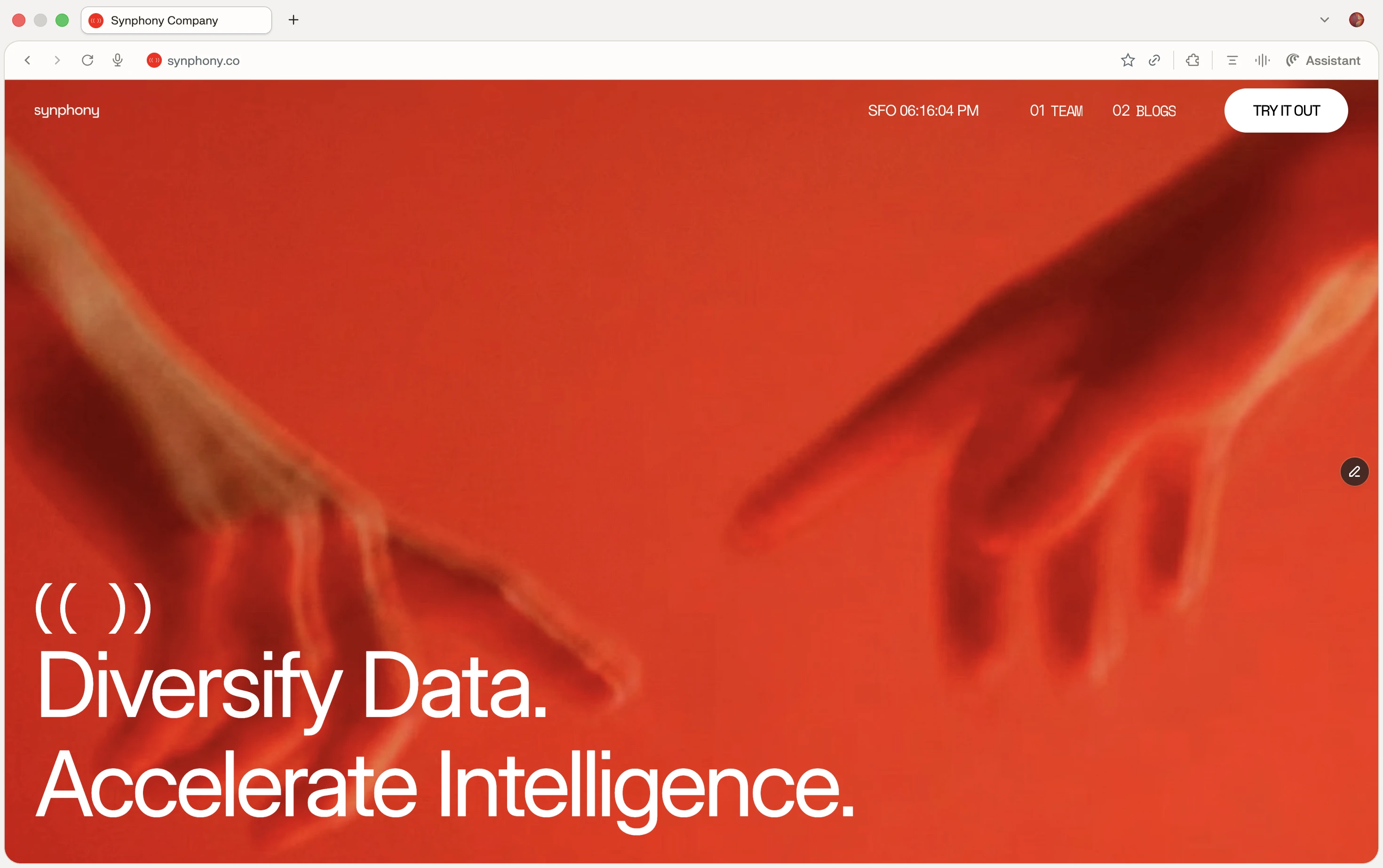
DISCLAIMER: SYNPHONY HAS SINCE REDESIGNED THEIR WEBSITE FOR DIFFERENT PURPOSES AFTER JOINING Y COMBINATOR. I HAD NO PART IN THE CHANGES YOU SEE; HOWEVER, THE BRAND IDENTITY IS STILL BEAUTIFULLY ON DISPLAY.

Thesis

Synphony arrived with a single asset, its name. I treated that name as the entire brief: the company multiplies signal, so the brand had to multiply it too, in the two languages the company actually speaks, sound and vision.

Intent

Synphony builds data-multiplication and pipeline infrastructure for large-scale robotics, sold B2B to technical buyers. When I came on, the company had a name and a placeholder, a template site with a stock icon doing the work of a logo. Nothing that made it Synphony existed yet. I built that from scratch: the identity system, the marketing site, a CMS backend so the team could run it without me, and the pitch deck. The job was to make an invisible, abstract product legible and ownable, fast enough to matter to an early team and sharp enough to sit next to the companies its investors back.

Insight

The name points at sound: Synphony, a symphony respelled. But the product's real modality is vision, the LiDAR and camera data a robot uses to understand a room. That tension was the unlock. Instead of choosing, I bet on the word sitting underneath both: signal. Sound is signal you amplify and multiply; vision is signal a machine multiplies into understanding. So I built one mark to live in both worlds, a soundwave at rest and an eye when it moves.

Decisions

Decision 1: Treat the name as the brief, not a constraint.

The one asset they had was an oddly spelled word. I could have worked around the spelling or built a generic robotics look around it. Instead I leaned all the way in: syn (synthetic, synchronized) plus phony (sound), a company that synthesizes signal at scale. The strange spelling became the most ownable thing about them.

Rejected: a safe, literal robotics identity that treats the name as a label to dress up rather than an idea to build from.

Decision 2: The mark: a harp, pulled toward a soundwave that doubles as an eye.

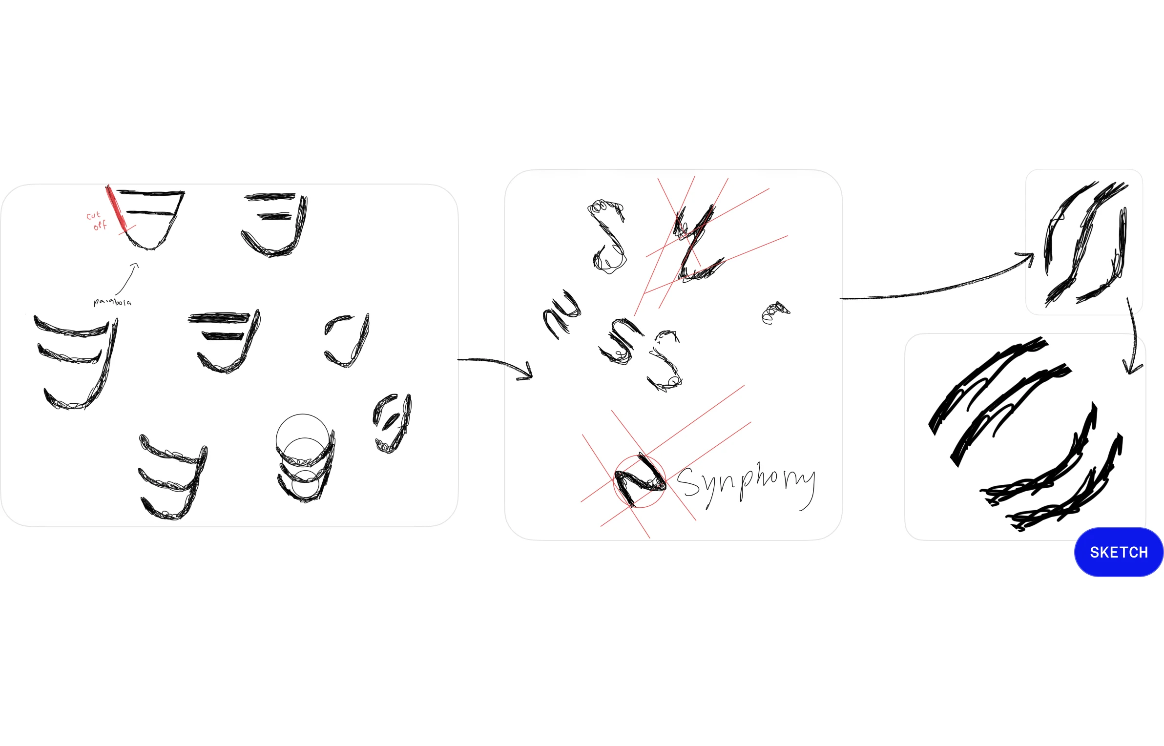
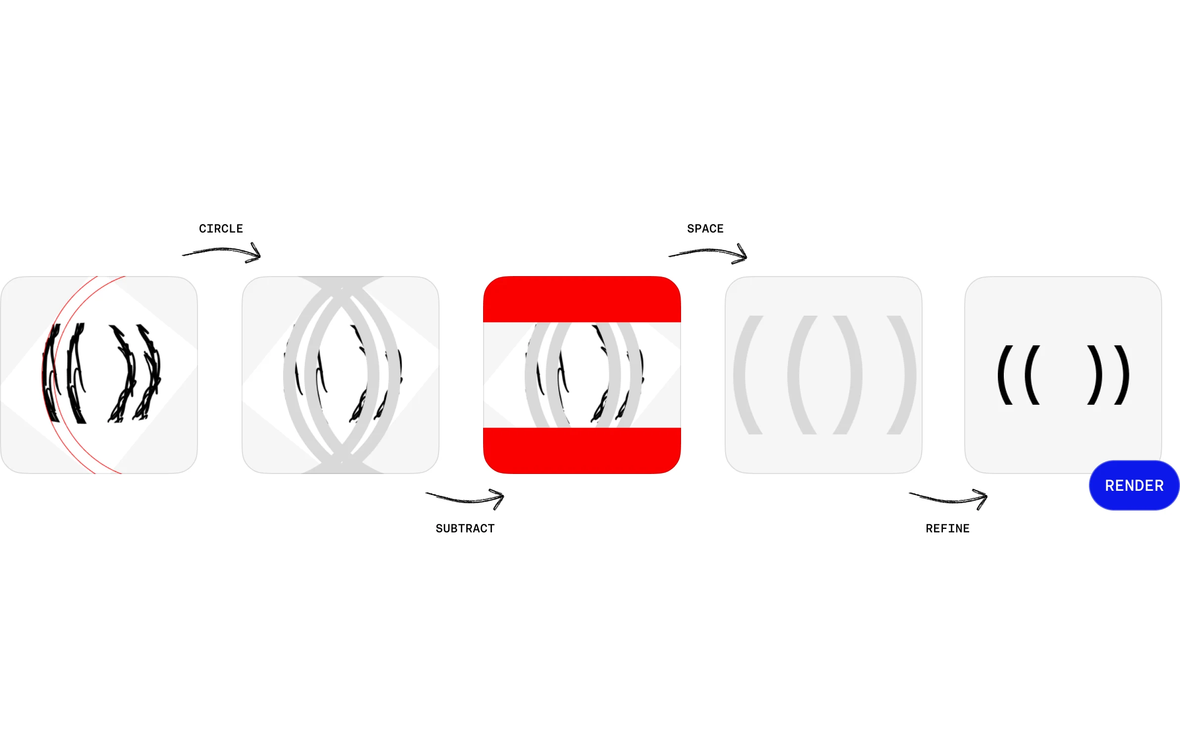
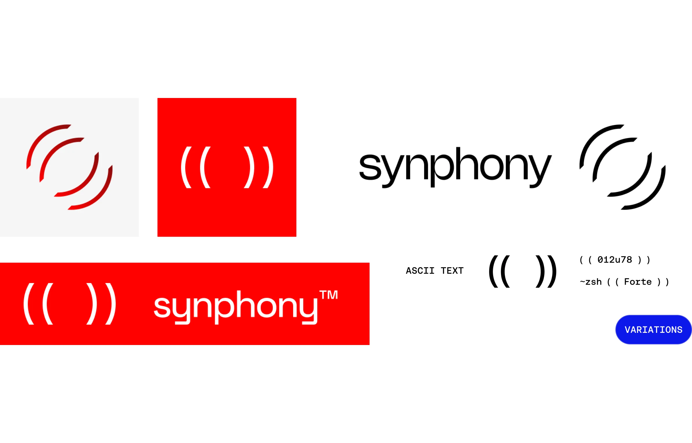
The mark started as a harp. I was drawn to the instrument itself, its ethereal pull and the exponential curve sweeping into its pillar, before I had a rational reason for it. The logic came after the feeling, which is how every project I make begins. I refined that curve on a geometric grid until it resolved into ( ( ) ), a soundwave abstract enough to hold at 16px. Two things fell out of that approach and my own technical sense for the work: because the product was mainly a command line interface (CLI), the mark renders in plain ASCII as ( ( ) ); and because vision is what their robots do, I built it to bloom, opening like an aperture. Same mark, from ASCII in the terminal to the marketing site's hero section, the kind of range and scalability I build into an identity on purpose. And like every mark I make, I leave it deliberately open: soundwave, eye, parentheses, a held breath. People are drawn to what their imagination can run with, so I leave an air of ambiguity in the work.

Rejected: the equalizer-bars cliché every audio brand reaches for, and a literal harp, too ornate and too human for deep-tech.

Decision 3: Name the products after how volume moves: Forte and Crescendo.

Each name maps to a behavior. Forte, an instant jump in volume, is the core algorithm that multiplies data in one step. Crescendo Pipeline, a gradual swell, is the white-glove service that integrates slowly into a client's existing stack. The names document the products instead of decorating them.

Rejected: functional names like DataGen or PipelinePro that label the category and teach the buyer nothing.

Decision 4: Color: LiDAR orange, against two defaults at once.

Deep-tech runs on two safe palettes, robotics-blue and the all-black "serious tech" look, and both vanish into the crowd. I chose a hot orange because it's the loudest color against a dark UI, and because it's the literal color of high-intensity returns in a LiDAR point cloud, the exact data their clients stare at all day. It's a citation, not a mood.

Rejected: the blue and the black everyone else defaults to.

Decision 5: Make the homepage perform the product.

The hero doesn't claim the product multiplies signal, it shows it. A dot grid carries waveforms that multiply, shift, and split, the mark blooms open, and the whole thing is staged on a recreation of Michelangelo's Creation of Adam, the two hands nearly touching, recast in LiDAR orange. The robots Synphony serves are embodied intelligence reaching for the spark; the homepage casts the company as what helps fuel that touch.

Rejected: a static hero with a headline and a screenshot, the default, and a wasted chance to demonstrate instead of assert.

Craft

Ideation board: harp and soundwave sketches, a direction pivot, and the final sketch.
Construction sequence on a geometric grid: circle, subtract, space, refine, render.
Evolution strip: mark variations, the sticker, the banner lockup, and the ASCII (( )) rendering.

The Motion Study

Where I'd take the mark next: Opening past the bloom into an eye that blinks and scans the room. Sound resolving into vision.

Motion

Prospect Funnel

An adaptive form helped field prospects by adapting inputs to the speciality they were in (e.g. investment, business, etc.).

Micro-Animations

Synphony logo shown with slight dynamism, blooming open, along with anchor cards interacting in their hover states.

Marketing

What I'd Change

Enlight and Echo each have a section like this where a teammate catches what I couldn't see. Synphony was solo, so nothing got caught, and the thing that slipped through was accessibility. The site performs the product, waveforms multiplying, the mark blooming, and I never asked how it performs for someone who arrives with motion turned off, through a screen reader, or on a keyboard alone. Ten hours is an explanation, not an excuse: settling the concept first is what made the speed possible, and access should have been settled with it. That's the change.

Outcome

Shipped the full identity, the marketing site, and a CMS the team could run without me. They gave me 24 hours; I delivered in 10, above agency standard, and I hand-delivered it, showing up at their apartment at 8pm mid-week to walk the team through the whole system, CMS and all. That number matters less than why it was possible: the speed was the dividend of settling the concept first. Once signal, multiplied was fixed, the mark, color, motion, and product names already had answers, and I was executing a decision rather than hunting for one. The identity went on to front the company through its YC and a16z raises. What the constraint cost: the motion shipped as a single bloom; the eye that blinks and scans the room stayed a sketch, the gif. With more time I'd build it out across the product UI, so the multiplication reads everywhere the data moves, not only on the homepage.

At that stage the brand's real job wasn't to sell the product, it was to win belief. I was building fundraising collateral, even if no one said so. The identity carried them through their raise; they've since grown past it, the site now fields clients instead of investors, and I've handed it off. That's the right arc for an identity built to take a company from zero to one.